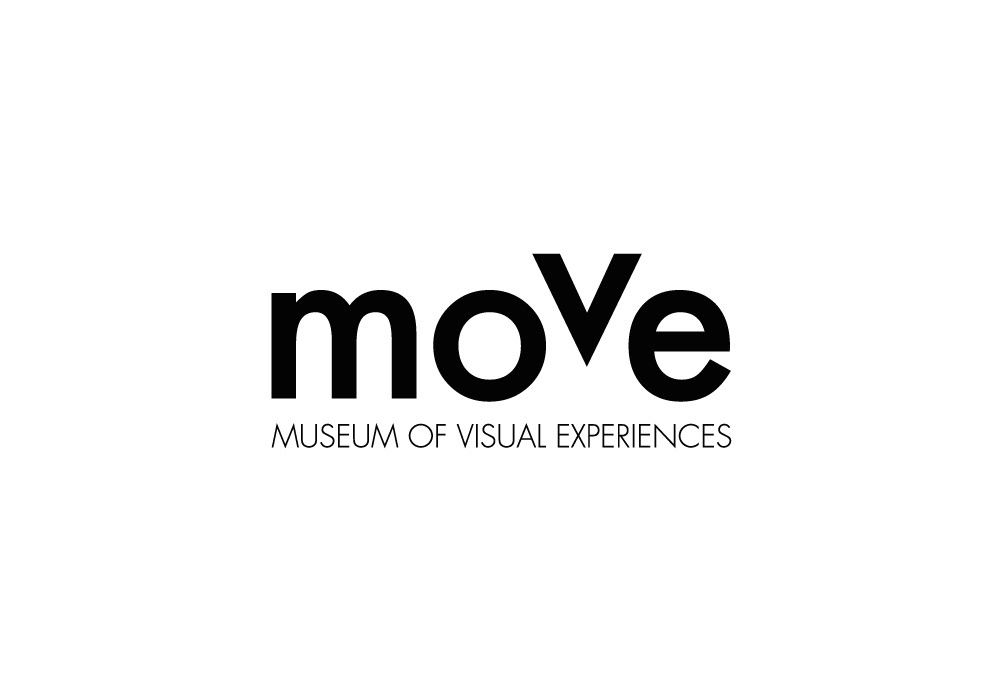
The Move is a graphic museum, both physical and virtual, with the aim to show and promote the international graphic protagonists.
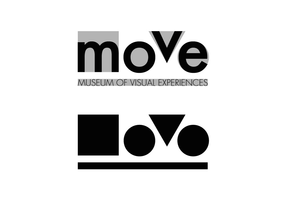
The Move logo’s concept comes directly from the motion. This is typographically represented by the displacement of the letter “V” which goes at a different speed than the other letters and seems to fly: letter “V” indeed stands for Visual, the most important word in the payoff Museum of Visual Experiences.
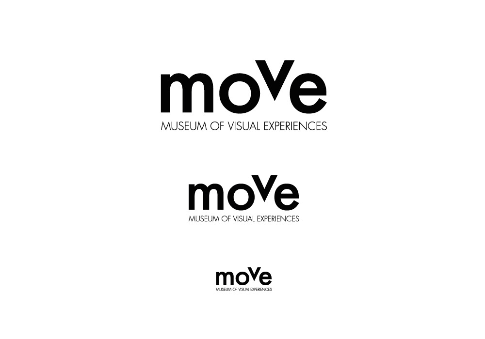
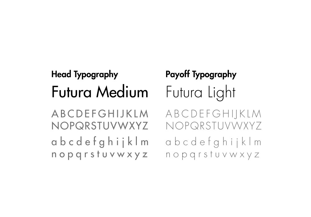
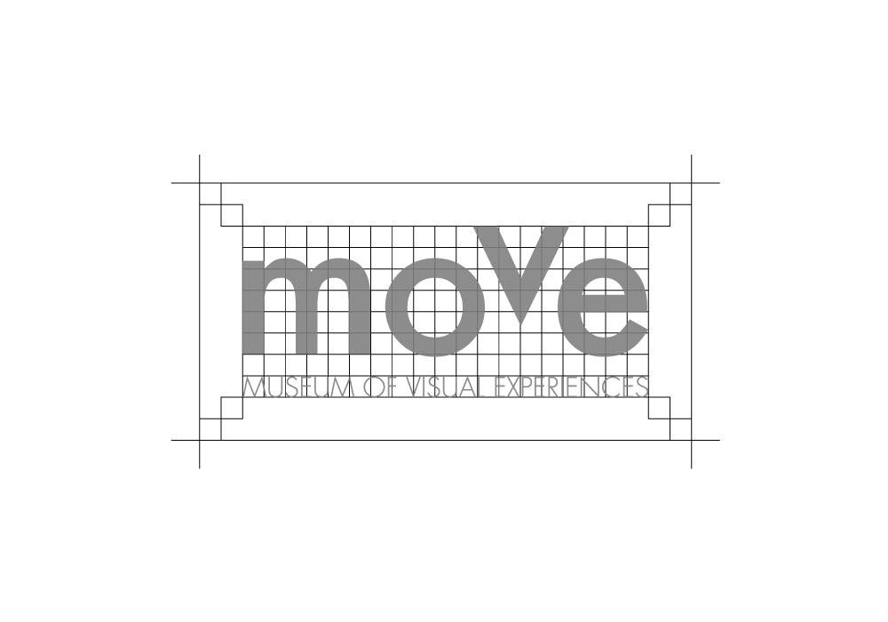
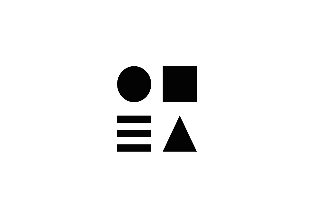
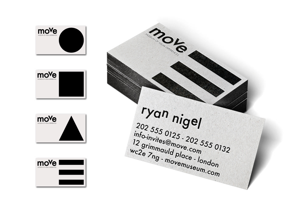
Since the Move is a graphic museum I used a geometric font like Futura. The color used for the move logo and corporate are black and white because these colors represent all the colors mixed-up in both additive and subtractive colors synthesis.
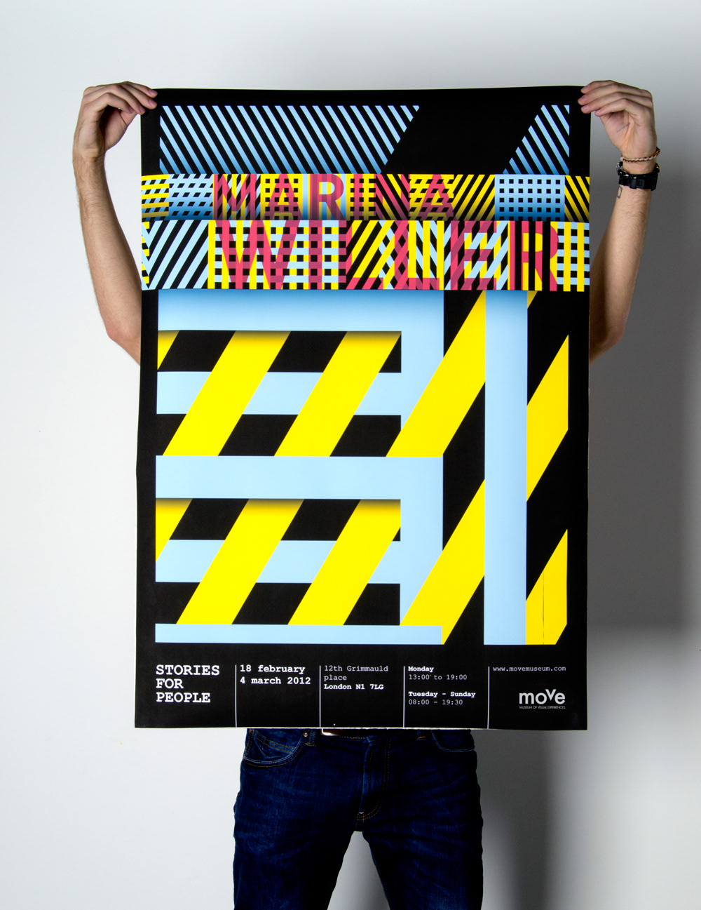
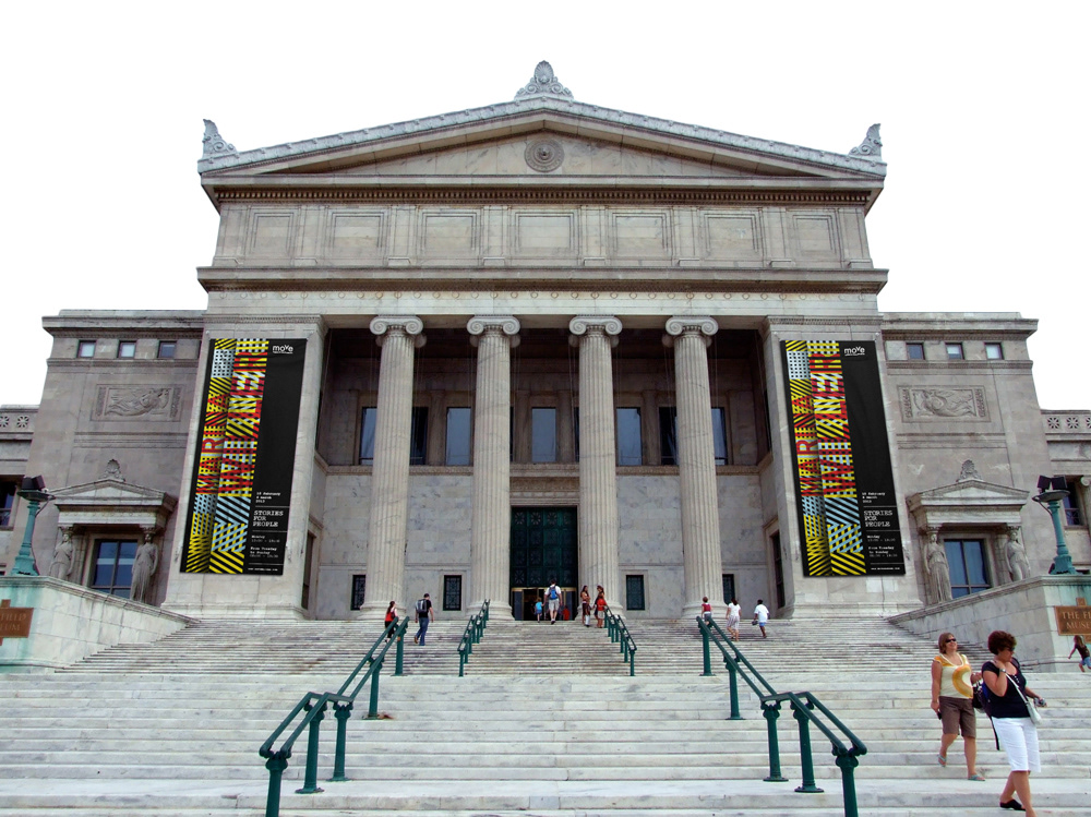
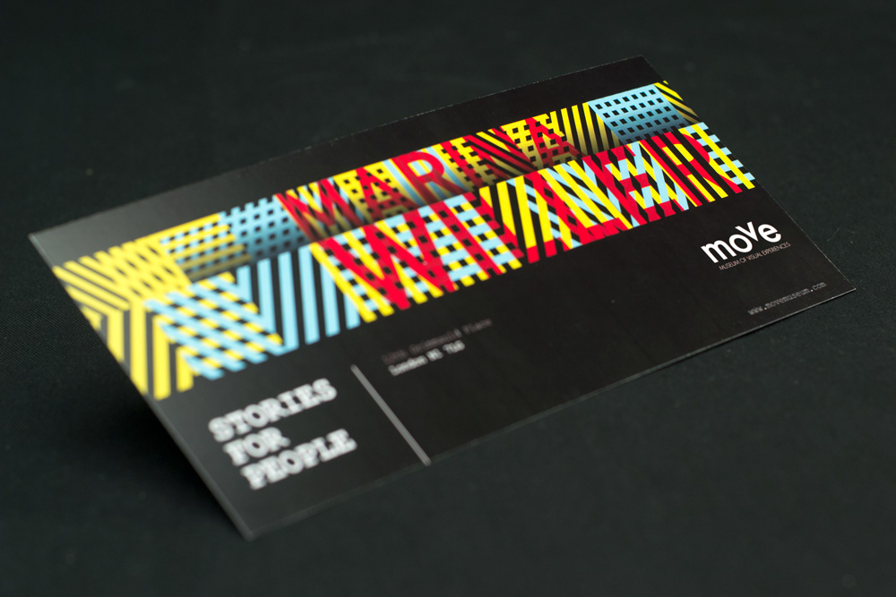
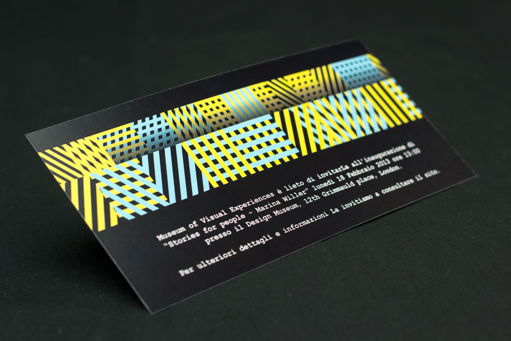
he visual identity of the Move museum was supported by the visual design of an exhibition dedicated to the brazilian designer Marina Willer. I created a poster, a big signboard and a formal invitation.
The idea behind these artworks is given by the combination of two elements: the first one expresses the movement that creates dynamism and symbolizes the museum; the second element symbolizes method and projects of the author. The final visual code takes its cue directly from the visual identity of Southbank Centre. The poster presents some intersections of basic geometric shapes, different in color and orientation.
The lines texture developes in three-dimensional direction with diagonal lines of force, giving the artworks a sense of movement, the same movement that underlies the concept of the museum itself.
You may also like
DH Project Illustrations
Graphic Design, Icon Design, Illustration,
Silence please
Interaction Design, Programming,
Rule of Variations
Flavour Safari
Branding, Illustration, Packaging,
Cyrano - gifts advisor
Graphic Design, UI/UX, Web Design,
Occorre un Uomo
Branding, Graphic Design, Illustration,
A migrant's journey
Graphic Design, Editorial Design, Journalism,
Putin riding a bear Vs Obama
Graphic Design, Editorial Design, Journalism,
Stargate
Branding, Graphic Design,